


For a long time I have been a big fan of black and white photography. There is something magical in seeing our world without color and realizing how much of a story light and dark alone can tell. In this blog post series I will try to give a few examples of how I come up with my decisions to produce a photo in black and white, what I focus on and maybe also how I actually do my post-production.
Blog Post
Why Photos Without Color are Beautiful - Part 1
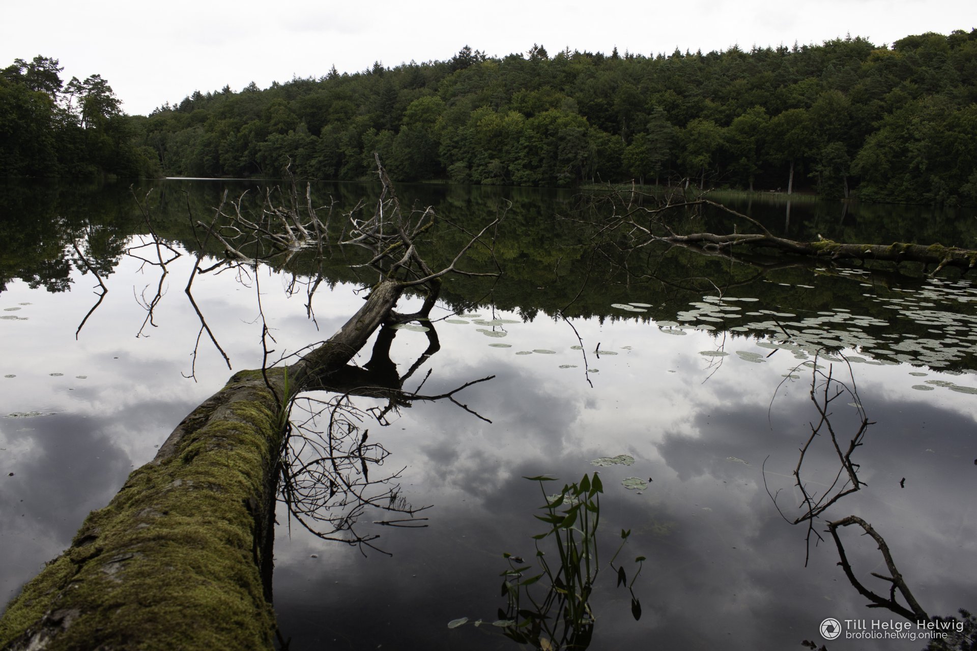
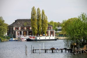
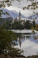
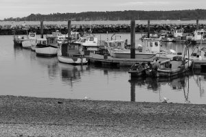
Above you can see the original, unmodified photo. When I look at it, I immediately notice a couple of things:
- The sky is a milky, boring nothing
- There are not enough different colors, so everything feels a bit too green
- The photo itself feels quite muted, mostly due to the direct sunlight on that day
But there are definitely some nice aspects about this photo as well:
- A nice separation of the photo through the strong line in the reflection
- The reflection itself is awesome, thanks to the super smooth water
- The tree gives the photo tension, a bit of a story almost
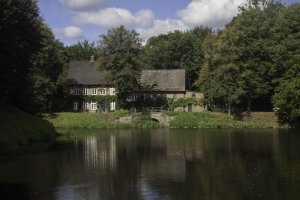
So, all in all I thought this photo could be something. I messed around a bit with boosting the colors, adjusting the brightness and contrast and more. But somehow the negative aspects remained and the result looked quite unappealing to me:

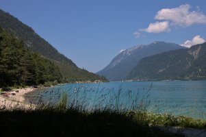
What you can see here is that the sky looks definitely better. The colors are popping more and it just overall feels more alive. But I still think that somehow the beautiful reflections are not really in the center of the image. And there is still too much of a uniform green tone to the entire photo, which keeps me from really enjoying it.
(If you have a hard time spotting what I'm talking about, click the image and then you can switch back and forth between them by swiping or using your arrow keys.)
So, looking at all the nice contrast and strong edges in this shot, I decided to try turning it black and white. Here is the result:
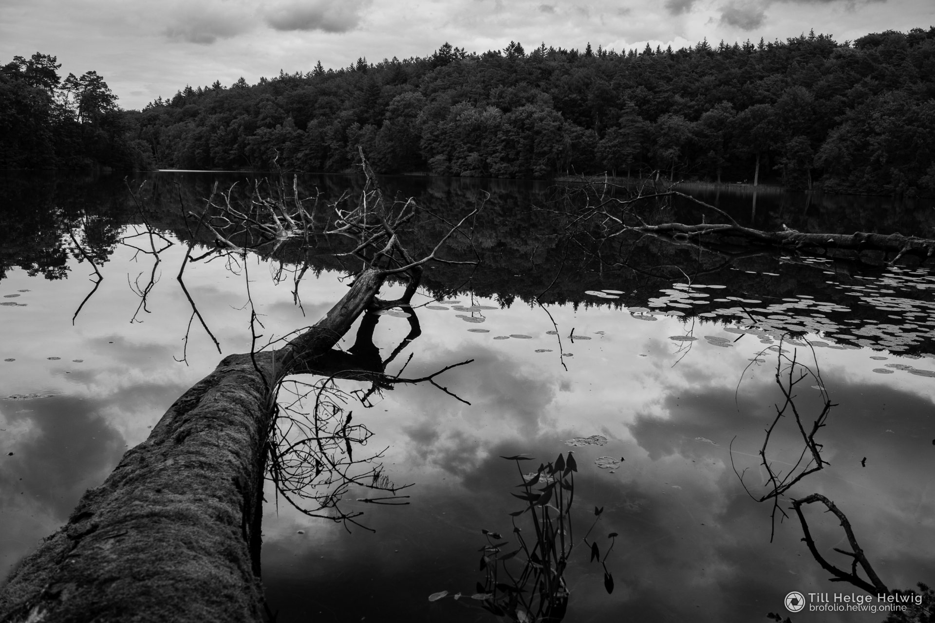
What I love about this is that the tree is still there, but is less obvious and doesn't distract as much from the reflection. The sharp line running through the reflection stands out more and the repetition of the sky in the water seems more emphasized to me. This conversion has totally transformed the mood of the scene.
Going black and white with a photo has some immediate consequences: While in post-production you often mess around a lot with the colors, trying to make them pop without turning them too artificial...the moment they are gone, this is not a concern anymore. Therefore it becomes possible to fully focus on the brightness, bump up contrast more than normally possible and go more heavy on some settings that in a color photo normally would be a no-go.
One thing to always keep in mind about black and white photography is: It's more abstract from the reality and therefore much easier to accept as a piece of art rather than a representation of reality. This automatically gives the photographer more license to experiment, because the viewer wouldn't notice it as disruptive or "wrong".
There are of course more black and white photos from me to be found on this website.