Blog

Welcome on your journey through our world of photography! Enjoy reading our latest articles:

Brofolio on Social Media

Just for having said it: I already deleted my Twitter account months ago, when it started going downhill. Today, Tristan decided to also say byebye to this account. And that also means that we killed the Brofolio account as well. The way this page is heading, does not align with our personal goals.

We have not decided yet, if we want to replace the account and restart on another platform. As it's been very quiet around this project for quite a while, I think we'll hold off for now. You can, however, find both of us in other places:

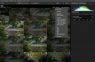
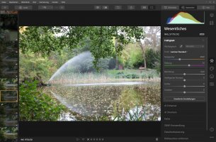
Luminar as Lightroom replacement

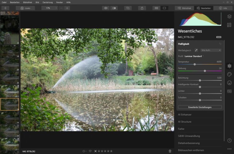
The de facto standard for photo management and editing has been and still is Adobe Lightroom. I've used it for quite some time, but lately I got annoyed at the subscription and cloud computing model Adobe is forcing all users into. As I am a hobby photographer, I only use photo software infrequently in general not very often. So, I started looking for more reasonably priced solutions for non-professionals and stumbled upon Luminar 4 by Skylum. For the last year or so I have been using it exclusively for my photo projects and here is my verdict so far.

Photo by Till Helge Photo by Till Helge

Differences compared to Lightroom:

  • No subscription model, but a fixed price license for two installations
  • Overall is slower and some features (e.g. spot removal) take quite a while
  • Exporting images takes much longer
  • Features are easier to access, overall a lot less menus to navigate
  • Settings are more obvious and easier to use, especially as a casual user

The most significant difference is probably that Luminar 4 is clearly built with ease of use in mind. It is not meant primarily for power-users and professionals. I think they could get used to it, but in my experience so far it doesn't feel like it's built for them. However, I'm quite happy with the results so far and managed to do everything I used to do in Lightroom before just fine.

I personally quite enjoy the black and white conversion tool and I don't remember that Lightroom offered something similar. You can not only convert your image to B/W in one click, you can afterwards adjust all color channels and define their intensity and even decide to return color saturation to one of them. While I'm sure you can do the same in Lightroom, I think there it is a lot more involved.

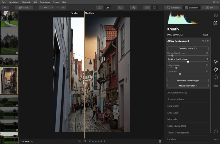
Always a fun option to have are their AI Sky Replacement and AI Augmented Sky features, which allow adding elements like clouds very conveniently to a photo or even replaces the entire sky with a different sky. Definitely a bit gimmicky, but a nice option if you're (like me) not very experienced in using Gimp, Photoshop or similar.

I think if I was using it every week, I might consider going back to Lightroom. But for my current and foreseeable needs this is the right tool.
Read the entire post

Why Photos Without Color are Beautiful - Part 1

For a long time I have been a big fan of black and white photography. There is something magical in seeing our world without color and realizing how much of a story light and dark alone can tell. In this blog post series I will try to give a few examples of how I come up with my decisions to produce a photo in black and white, what I focus on and maybe also how I actually do my post-production.
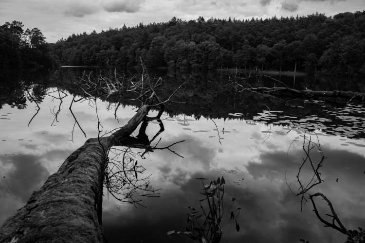
Photo by Till Helge Photo by Till Helge

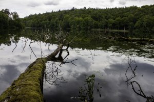
Above you can see the original, unmodified photo. When I look at it, I immediately notice a couple of things:

  • The sky is a milky, boring nothing
  • There are not enough different colors, so everything feels a bit too green
  • The photo itself feels quite muted, mostly due to the direct sunlight on that day

But there are definitely some nice aspects about this photo as well:

  • A nice separation of the photo through the strong line in the reflection
  • The reflection itself is awesome, thanks to the super smooth water
  • The tree gives the photo tension, a bit of a story almost

So, all in all I thought this photo could be something. I messed around a bit with boosting the colors, adjusting the brightness and contrast and more. But somehow the negative aspects remained and the result looked quite unappealing to me:

Photo by Till Helge Photo by Till Helge

What you can see here is that the sky looks definitely better. The colors are popping more and it just overall feels more alive. But I still think that somehow the beautiful reflections are not really in the center of the image. And there is still too much of a uniform green tone to the entire photo, which keeps me from really enjoying it.

(If you have a hard time spotting what I'm talking about, click the image and then you can switch back and forth between them by swiping or using your arrow keys.)

So, looking at all the nice contrast and strong edges in this shot, I decided to try turning it black and white. Here is the result:

Photo by Till Helge Photo by Till Helge

What I love about this is that the tree is still there, but is less obvious and doesn't distract as much from the reflection. The sharp line running through the reflection stands out more and the repetition of the sky in the water seems more emphasized to me. This conversion has totally transformed the mood of the scene.

Going black and white with a photo has some immediate consequences: While in post-production you often mess around a lot with the colors, trying to make them pop without turning them too artificial...the moment they are gone, this is not a concern anymore. Therefore it becomes possible to fully focus on the brightness, bump up contrast more than normally possible and go more heavy on some settings that in a color photo normally would be a no-go.

One thing to always keep in mind about black and white photography is: It's more abstract from the reality and therefore much easier to accept as a piece of art rather than a representation of reality. This automatically gives the photographer more license to experiment, because the viewer wouldn't notice it as disruptive or "wrong".

There are of course more black and white photos from me to be found on this website.

Read the entire post

Slovenia: A Photographer's Dream - Part 3

This is the third and last post about my vacation in Slovenia last year.

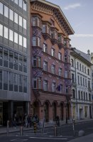
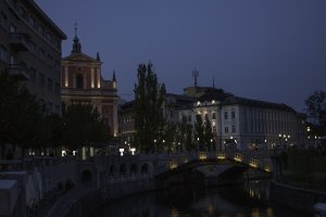
The last leg of my journey brought me to Slovenia's capital, Ljubljana. Overall I would say that it is a very typical central-European city. Nestled in the flat area between several hills the beautiful old city center is surrounded by commercial and residential districts. On the outskirts there are also some industrial areas.

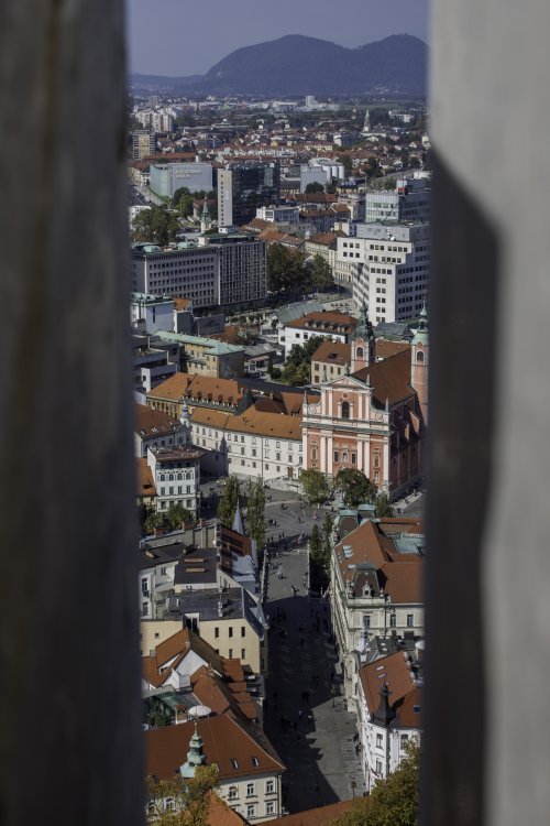
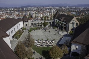
Photo by Till Helge Photo by Till Helge

As you can probably imagine, I focused mostly on the old city, as it has all the beautiful sites and is very pedestrian-friendly. In fact, the entire area surrounding the castle, Ljubljana grad, is a pedestrian area. The castle overlooks the city from its perch on one of Ljubljana's hills. It is well worth a visit, as it is filled to the brim with Slovenia's and Ljubljana's history and has a tower with a 360° panorama of the entire city and its surroundings.

At its feet, the Ljubljanica parts into two river arms that flow around either side. The old city follows one of the arms almost for its entire length and thus consists mainly of the riverside promenades with lots of restaurants and cafés. The centerpiece is the Preƥernov trg with its three bridges, the Preƥeren monument and the Cerkev Marijinega oznanjenja, a Franciscan church from the 17th century.

Aside from the nice landmarks Ljubljana is also a very interesting city to visit. It is a cultural melting pot with influences from all the neighboring countries especially, but as a European capital city with a university it also attracts people from all over the world.

Photo by Till Helge Photo by Till Helge

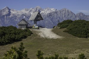
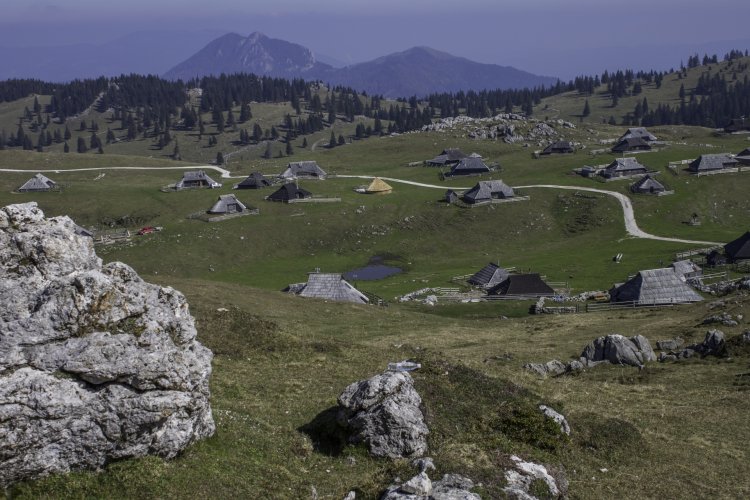
For my last day-trip I decided to follow up on a small remark in my travel guide. It recommended visiting the Velika Planina , a high plateau in the Kamnik Alps that is home to a small sheepherders settlement. So, I drove to the valley station (at about 500 meters) of the cable car that would bring me up to the lower rim of the high plateau at about 1,350 meters. From there it is normally possible to take a chairlift up to the top, but I had just missed the end of the season. So, I took an unexpected hike up there to the top station of the chairlift, which sits at about 1650 meters.

From there you have an absolutely beautiful view of the mountain panorama and down over the wide plains of the Velika Planina with its characteristic traditional herdsmen huts. I was there in October, so the sheep had already been brought down to their wintering grounds and most of the settlement was empty. This, however, increased the intense feeling of peace and serenity I felt up there.

Now that I have been there, I can definitely understand all the good things I had heard about Slovenia. It is a small, but really interesting and beautiful country with so many different things to see. Hopefully my photos have given you a little glimpse and made you add Slovenia to your list of places to visit. I am certain that I will be back.

Read the entire post

Slovenia: A Photographer's Dream - Part 2

As I said in my last post, I went to Slovenia in 2017 to find out what everybody is gushing about whenever the country is mentioned. The second part of my trip led me to the 43km long strip of Adriatic coastline that is squeezed in between Italy and Croatia.

Photo by Till Helge Photo by Till Helge

For convenience reasons I picked a hotel in PortoroĆŸ . I knew nothing about this city and was very surprised when I arrived. It is the only city on Slovenia's coast sheltered behind a a protruding headland and as such has bloomed into a real Mediterranean holiday resort. Aside from its huge marina and the long and fully accessible promenade it mostly consists of hotels, restaurants, clubs and all the other accommodations tourists need for a beach vacation.

Photo by Till Helge Photo by Till Helge

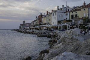
The real reason why I definitely wanted to include this part of the country in my trip, however, is Piran . This pearl of a town sits right on the tip of the aforementioned headland and despite its small size manages to tick all the boxes on the list of delightfully typical Mediterranean characteristics. The first thing I spotted when I came over from PortoroĆŸ was the marina, which sits just in front the Tartinijev trg (Tartini Square), the town's very obvious center of life. From this plaza, narrow streets wind their way between lots of small houses, all still in the characteristic medieval architecture. These provide some very necessary shade to escape the blazing heat of the sun.

Its geographical position means that Piran has two very distinctly different parts. The downwind side is pleasant, calm and inviting with its coast promenade and lots of restaurants and cafes. If, however, you walk all the way to the tip, you can take a look at the windswept side that is open to the Mediterranean Sea. I had a hard time getting up again once I had settled myself into the shade to stare out at the waves and enjoy the cool breeze.

Photo by Till Helge Photo by Till Helge

After soaking up as much sun as possible, I started towards the last leg of my journey. On the way back up North, I made two stops. The first was at another famous cave system, the Postojnska jama . It is very different from the Ć kocjanske jame I visited on my way South. The tourist center built around the cave is quite large, with a dedicated hotel, restaurants, souvenir shops and more. In comparison it was definitely much more crowded. The reason probably is that access to this cave does not involve a hiking trip and long walks along damp tunnels. There is a narrow-gauge railway that brings visitors down into the cave and later back out again. Once down there, a guided tour leads through the cave with very little room to take good photos.

Overall, the cave is worth a visit and especially comparing the two caves is quite interesting. But if I only had time for one of them, I would definitely pick the Ć kocjanske jame over this one.

My second stop was Rakov Ć kocjan , a 300m deep valley that is not very well known. I noticed it on the map and decided to check it out. This is not a typical tourist attraction. There is no tourist center or even a proper parking lot. The area contains several hiking trails that lead down into the valley and they are fairly reasonably signposted. The main attraction of this area are two natural bridges. Unfortunately, the valley occasionally is flooded, which was the case when I got there. So, I didn't get to see all of it, but still enjoyed exploring this remote place.

In the last post I focus on the capital and my unplanned mountain climbing trip.

Read the entire post